ONE PIECE - "SET SAIL WITH US, NAKAMA"
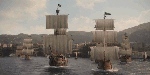
Coming off Netflix’s failure with the live action Cowboy Bebop, I was tasked with setting the global campaign strategy for our next big-budget, live action adaptation of my favorite manga of all time: One Piece. Since its first release in 1997, it’s been the #1 selling manga of all time and #2 best selling comic book in the world. The One Piece fandom was notoriously critical and skeptical of Netflix’s ability to adapt “the unadaptable.” We had to set a strategy that could earn their trust back.
Roles: Client (Campaign Lead), Conceptor (Letters From Oda, Wanted Poster Cast Announces)
Results: Season 2 and 3 Renewed, 2nd Most Popular Netflix Consumer Product Line (Behind Stranger Things)
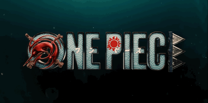
A Live Action Logo - Adapting An Icon
There were huge plans for consumer products, which had to start ASAP. As such, we were forced to adapt the logo during the script phase of the show. And it had to be completely different from the anime and the manga logos.
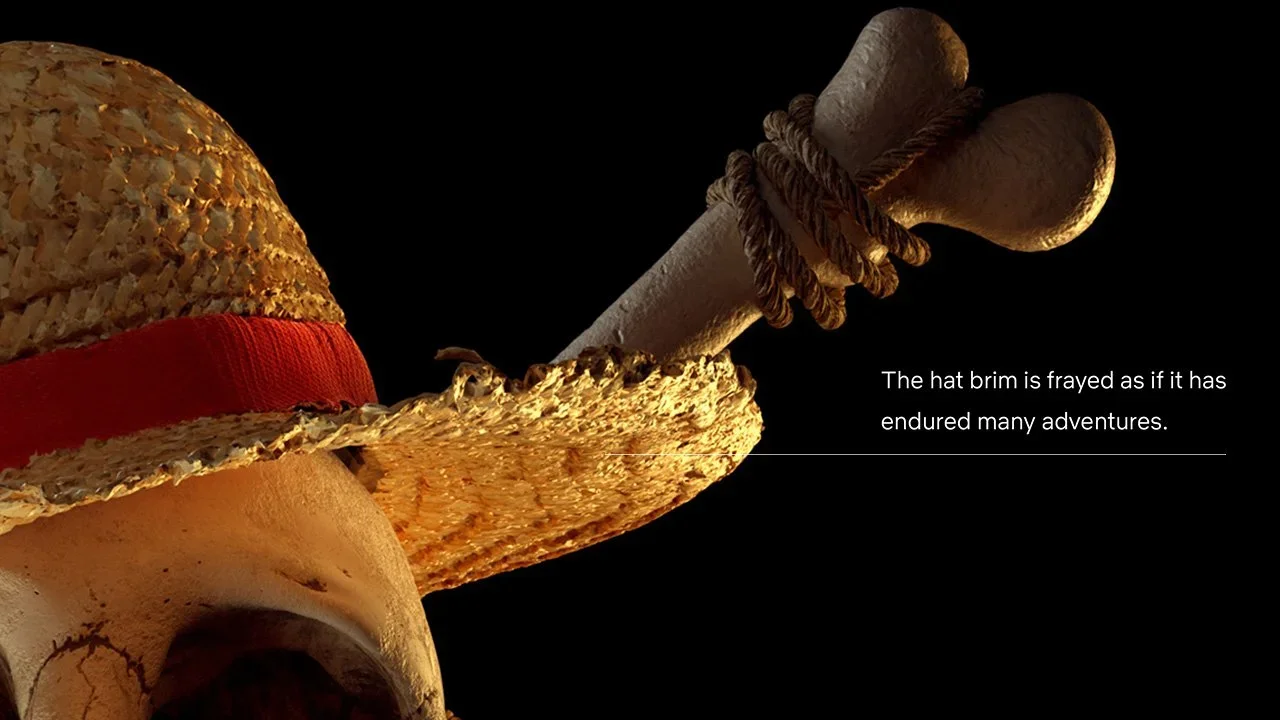
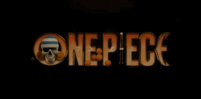
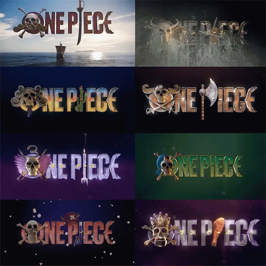
How do you adapt the most beloved manga of all time? Carefully and faithfully. We set out to evolve One Piece into a compelling, modern brand – one that elevates the epic fantasy pirate genre while standing the test of time. By adding dimension, textural realism, drama, and a hint of humor, the new identity captures the eccentric, whimsical nature of the One Piece world and the cinematic scale of their wild, nautical adventures.
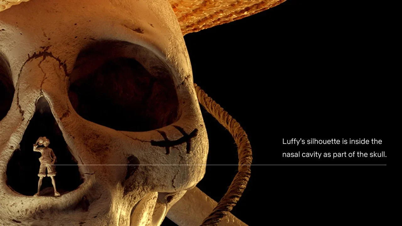
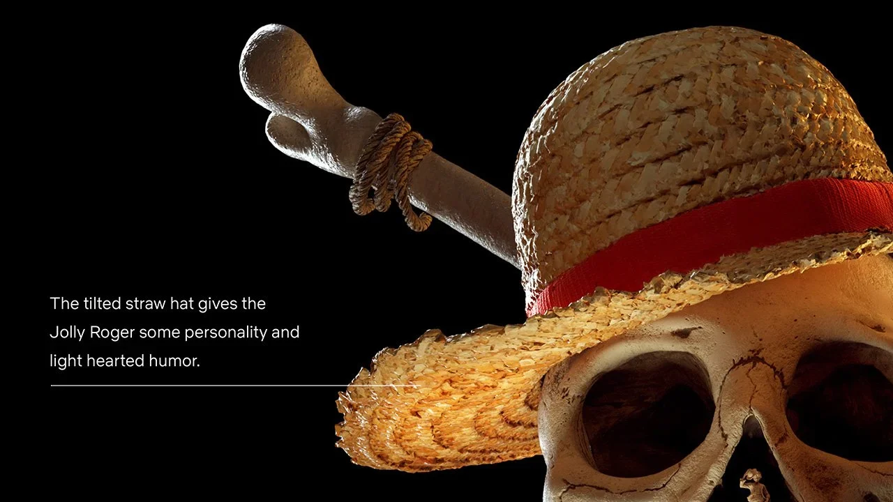
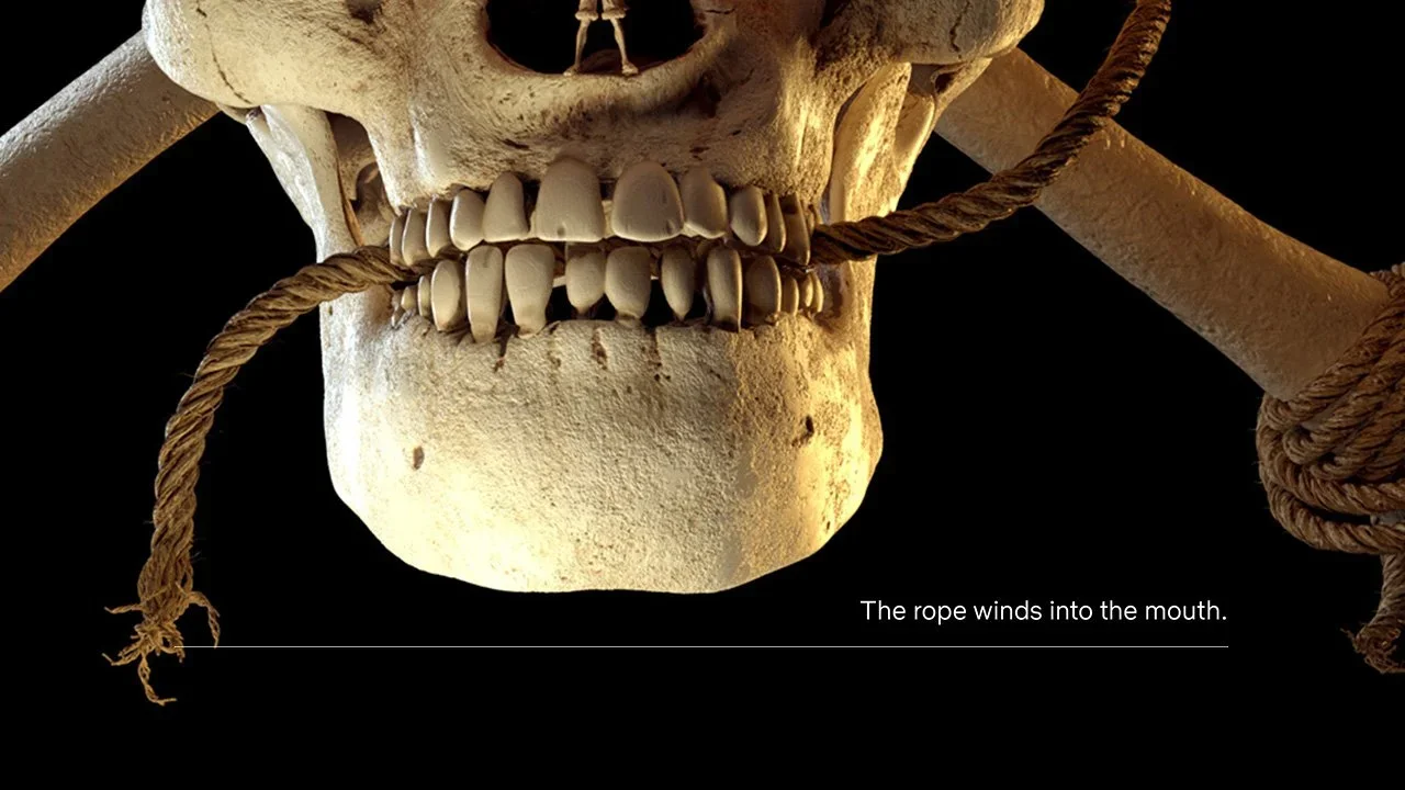
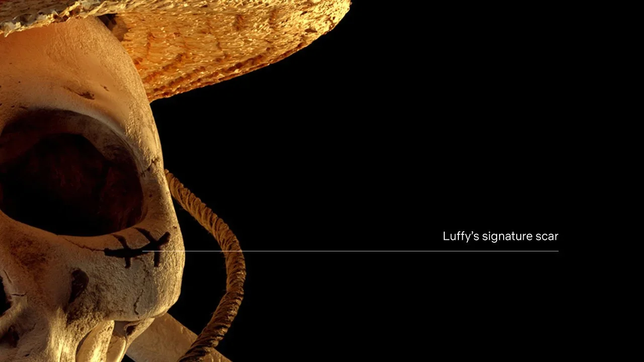
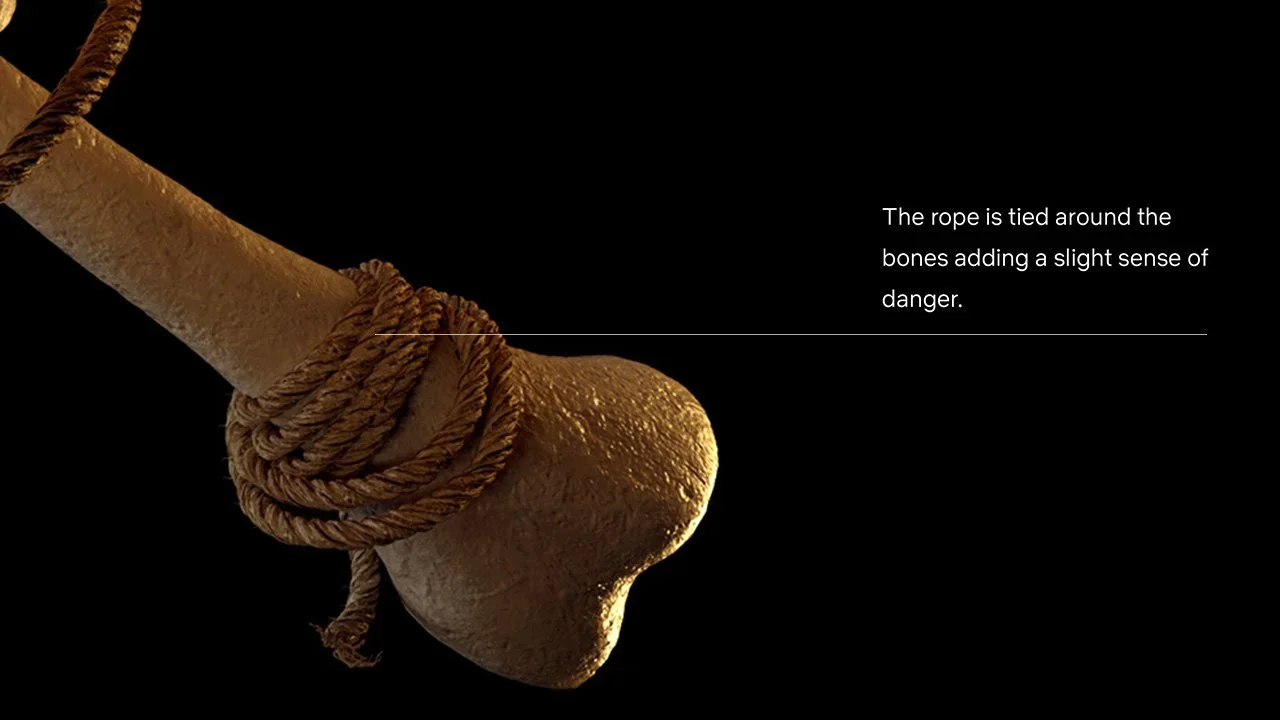
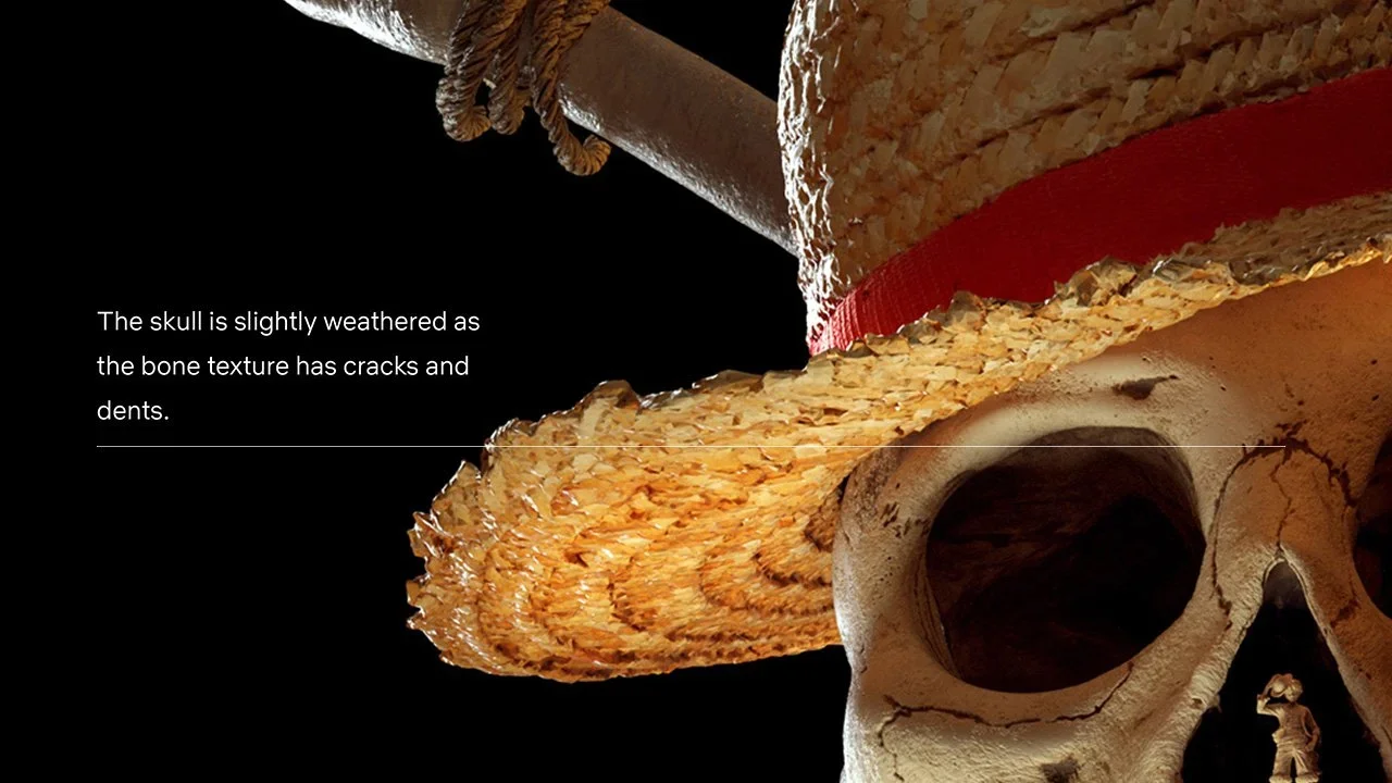
While retaining many of the key elements from the original manga logo, the Netflix logo simplifies and provides a fresh, modern look by pairing a bold, contemporary sans serif typeface with a photorealistic Jolly Roger redesigned to incorporate key details that are iconic to One Piece. We worked directly with wardrobe and production to ensure the hat would match the actor’s. It was my idea to include the original Luffy in the center of the skull. The rich, weathered textures add life and realism to the title representing the many adventures that the Straw Hat Pirates crew have encountered at sea.
The resulting identity stays faithful to the source material while providing a visual refresh that feels new, universally inviting, and most importantly, real.
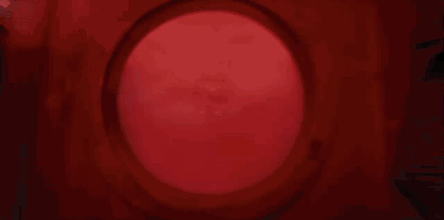
The logo was designed with animation in mind. We started with the idea of pulling the camera back from Luffy through the nostril of the Jolly Roger to reveal its entirety. The “O” of the logo and the cross bones rotate in a circular motion, evoking a ship’s wheel or a compass. The animation can be played forward or backwards, working flexibly as either an intro or outro into footage.
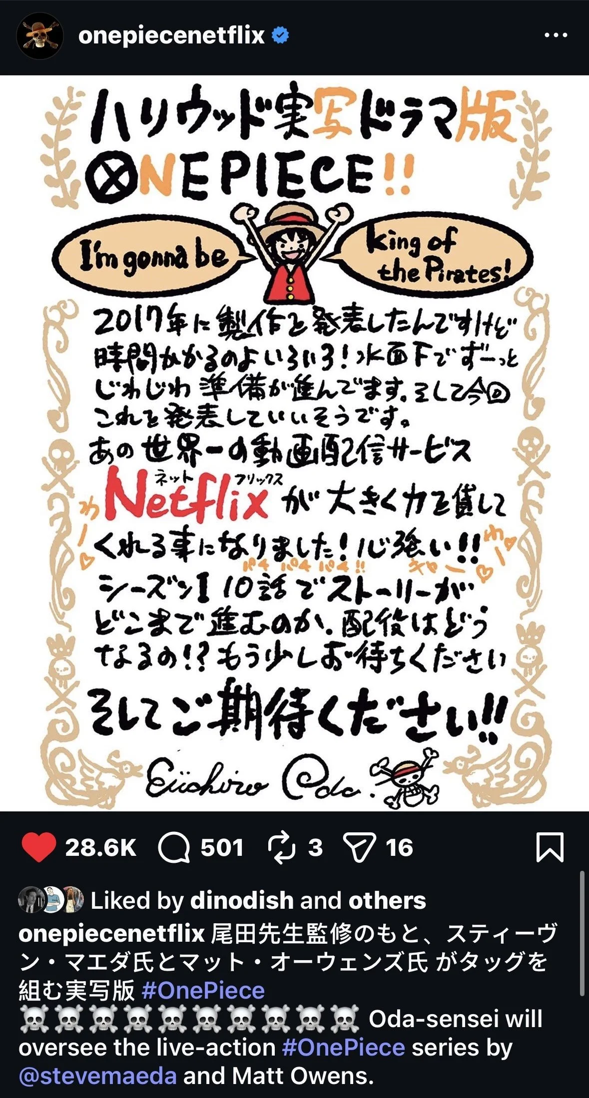
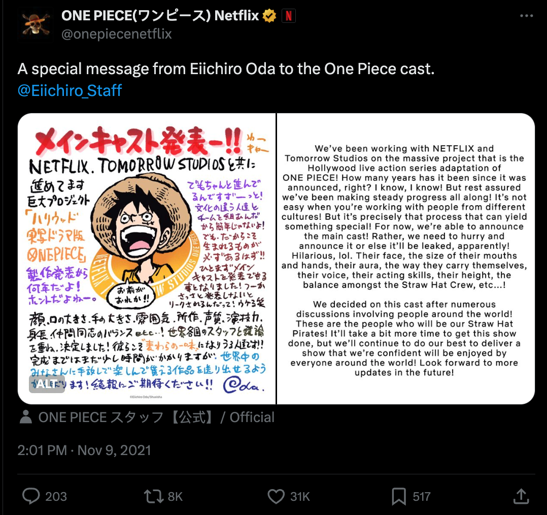
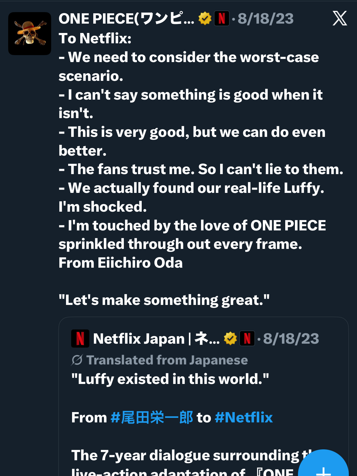
The best part about the entire process, the original manga creator, Eiichiro Oda, had zero notes and thought we captured the spirit of the original perfectly in a fresh way.
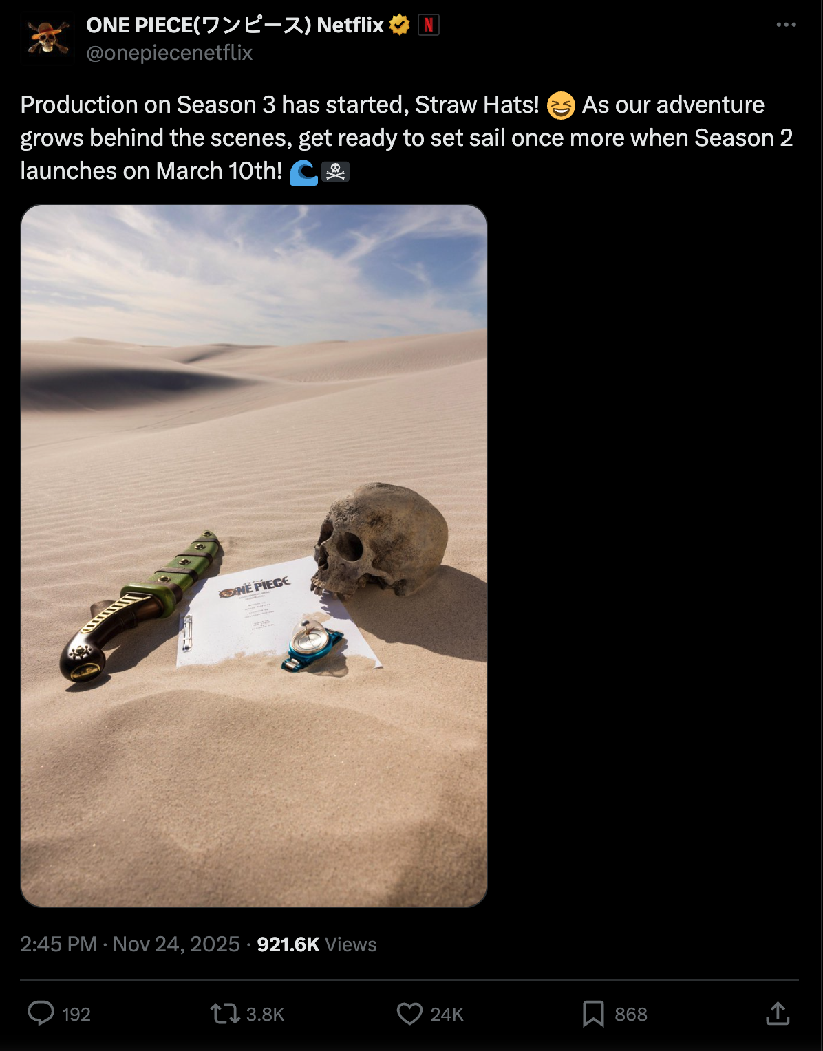
We had also pitched the idea of creating custom character logos. The showrunners loved the logo design and idea so much, they took our suggestion to adapt it for every episode with custom graphic transitions. The fans absolutely loved it, and the tradition will continue in Seasons 2 & 3.
A Global Strategy - The Netflix Namaka
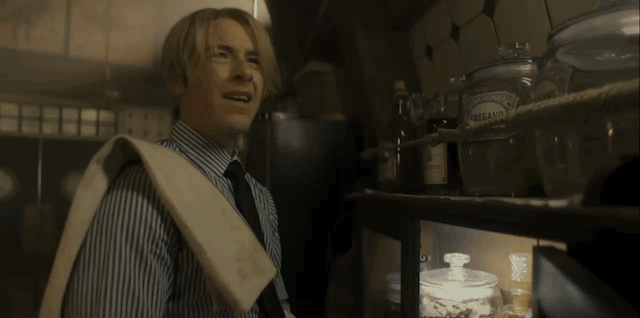
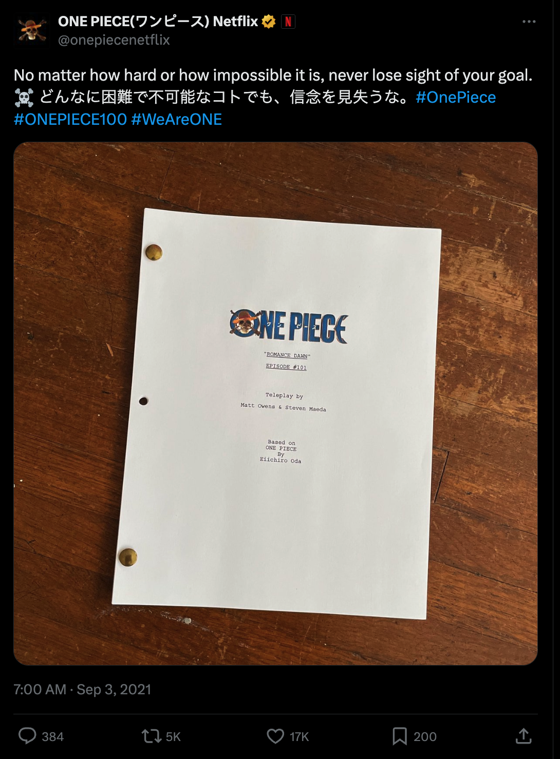
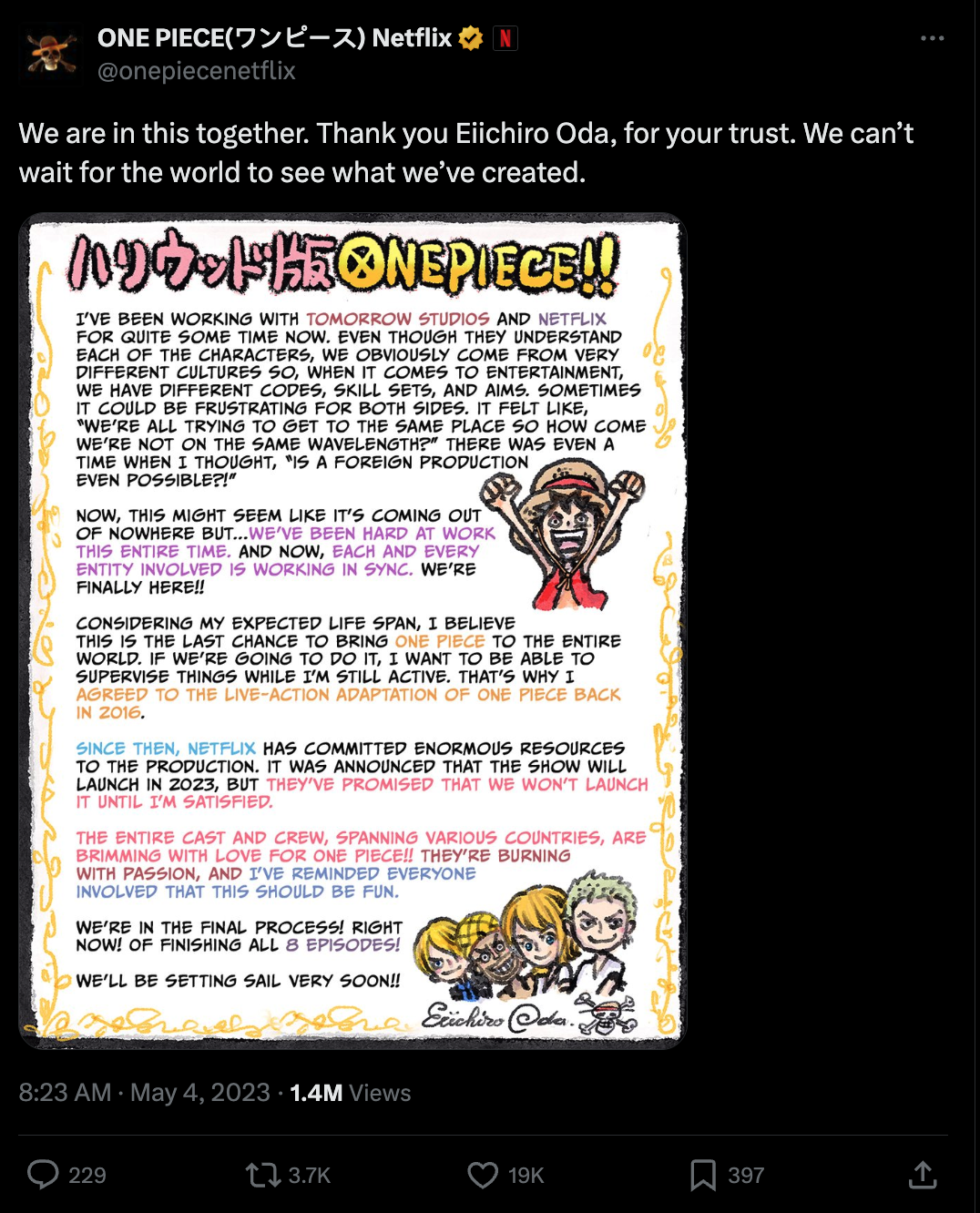
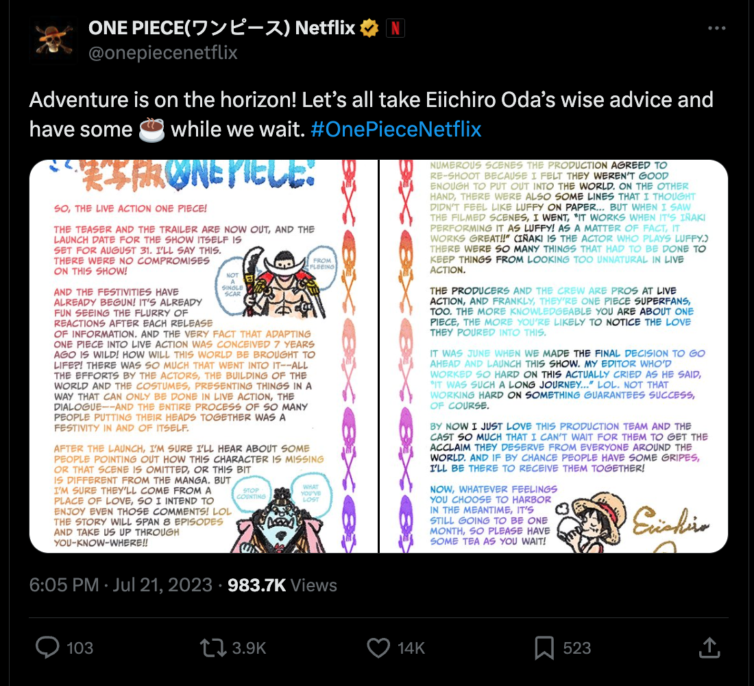
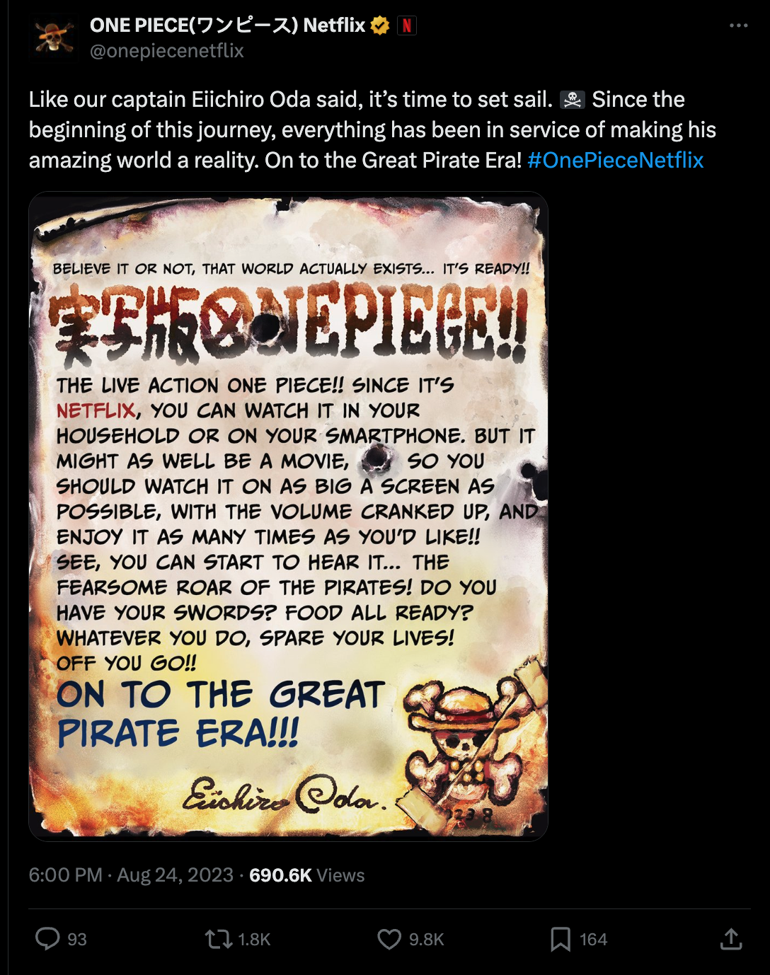
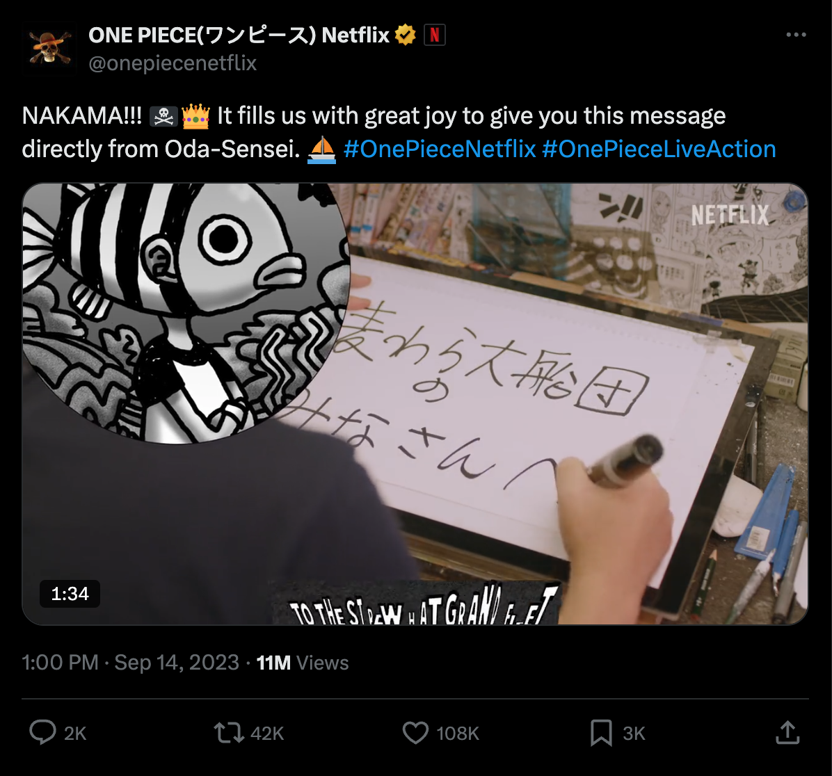
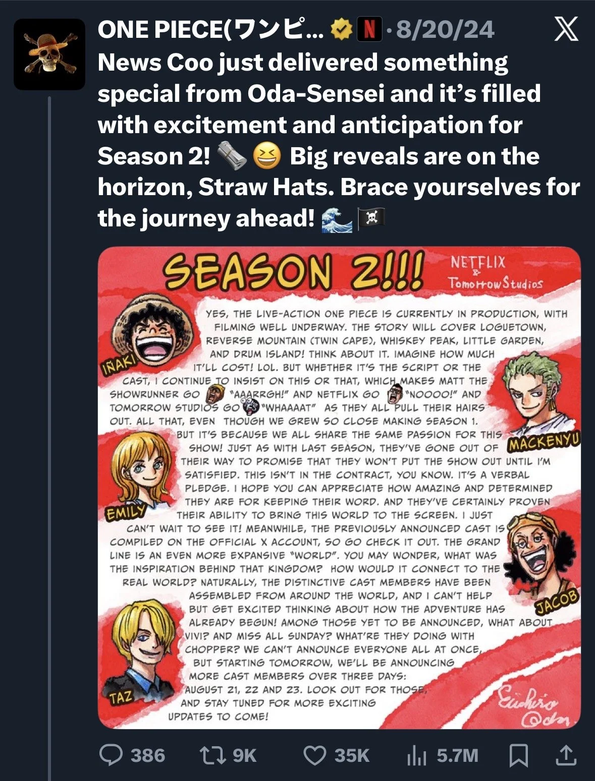
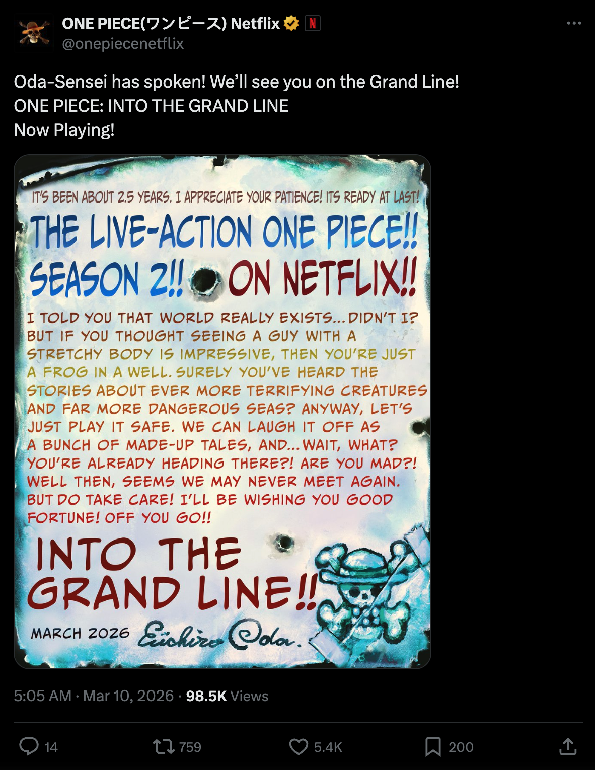
The original manga creator, Eiichiro Oda was heavily involved. So, we used it to our advantage and invited the One Piece fandom in earlier. Our strategy was to lean on him and his authenticity as creator to ensure any live action changes were part of his vision and any deviances from the manga and anime canon were purposeful. He wrote personal letters with updates, appeared on camera for the first time for us (face obscured to keep his identity secret), and personally approved all marketing assets. This kind of authenticity helped to reestablish trust with our Netflix Nakama.
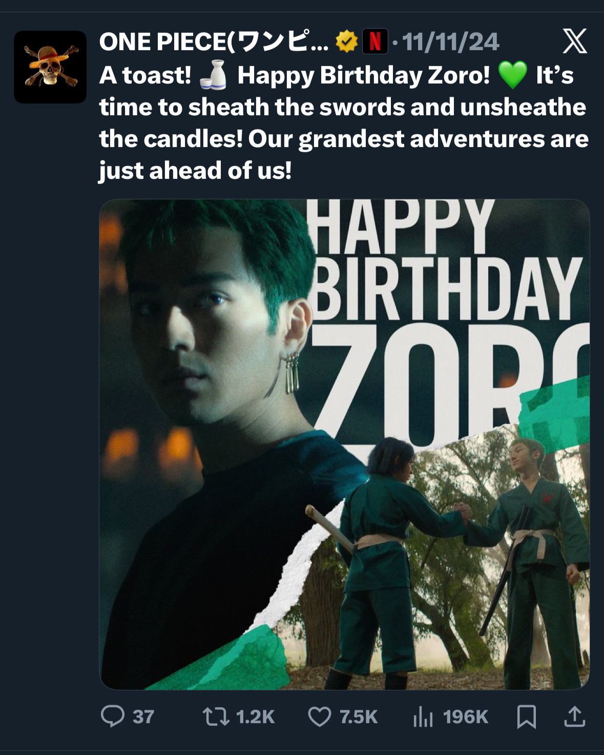
We started title social pages almost a full year ahead of normal. I personally ran the channel for 6 months at zero cost, encouraging fan theories, dream casting, announcing production and casting updates like script covers & more so the whole fandom felt invited and included. We acted like fans, celebrating characters’ birthdays, manga anniversaries and resharing anime memes & franchise updates alongside official One Piece accounts. To ensure all the fandom could enjoy it, we also translated all posts into 6 of the most popular languages for the manga globally. All these traditions continue to this day. By the time I shifted from series to the film team, I had grown the channel from 0 to 600K fans before a single frame of the series had even been shot. By acting like a fan for the fans, and inviting them in earlier and as often as possible, everyone felt like they were on this journey with us. A true nakama.
Wanted Poster Cast Announcements
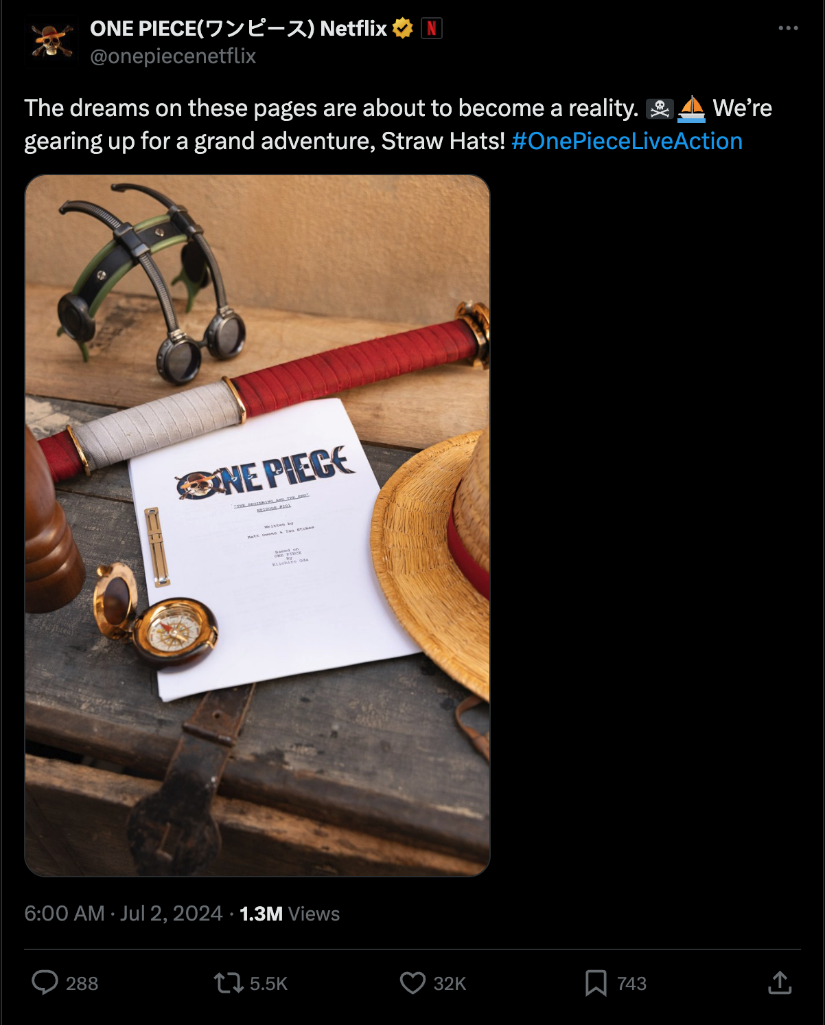
We had no idea what the show would look like and knew any news would leak quickly, but we wanted the casting to feel authentic and real, so we used the Wanted Poster look and feel to announce the cast with headshots.
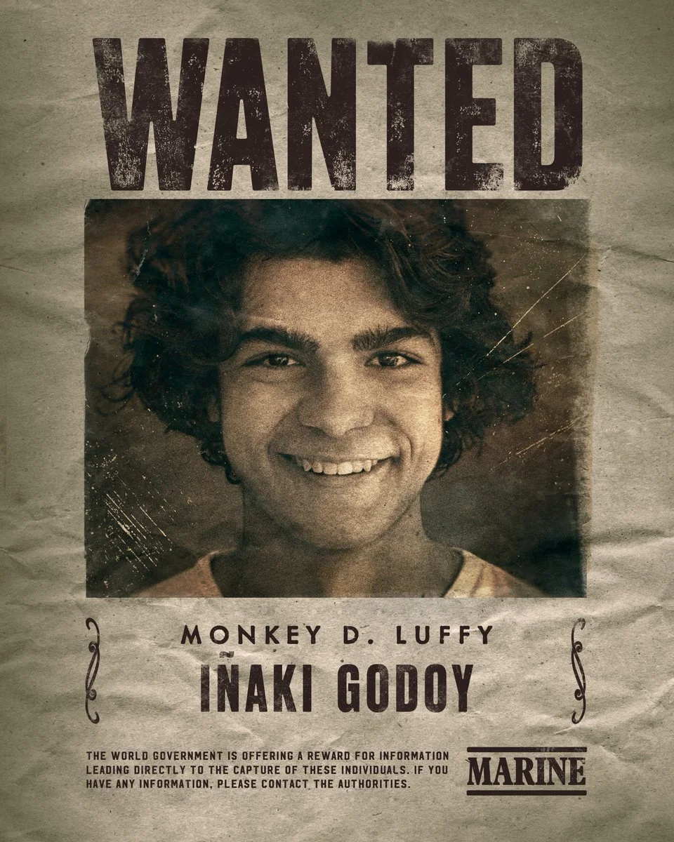
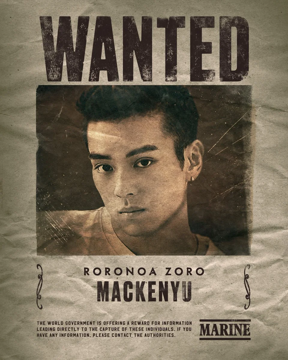
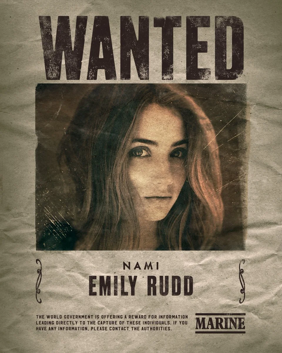
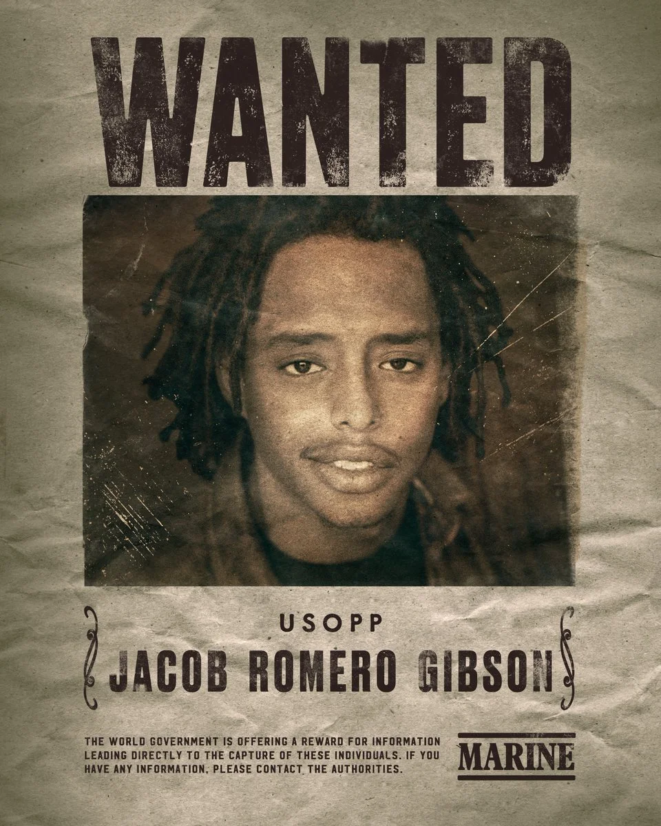
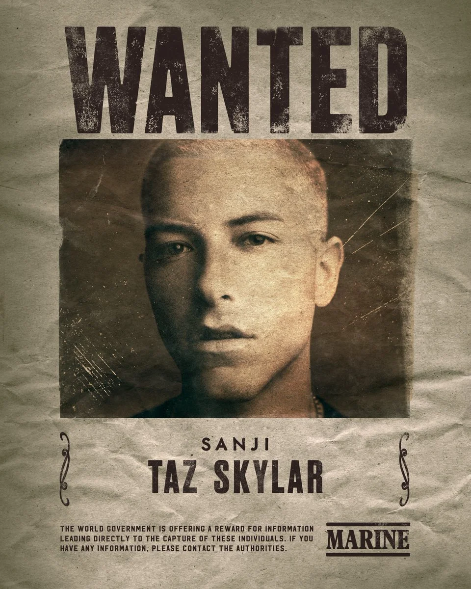
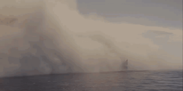
As sets were built and additional cast announce, we were able to film the wanted posters in situ and give a sneak peek of the world in progress, complete with easter eggs and custom letters from Oda himself in the real world.
The pirates are here! pic.twitter.com/0m4ljw17VN
— ONE PIECE(ワンピース) Netflix (@onepiecenetflix) August 25, 2023
Agency Partners: Arisu (Logo & Wanted Poster Design)
Netflix Partner: Jean Tannis